I'm gradually working out that "less is more" seems to be the best mantra for HDR images. I actually do like some of the amazing, wildly overdone stylised HDR images out there, but for my own purposes I think I was trying far too hard to turn night time shots into pseudo-day lighting, and thus fighting a lot of digital noise in the process.
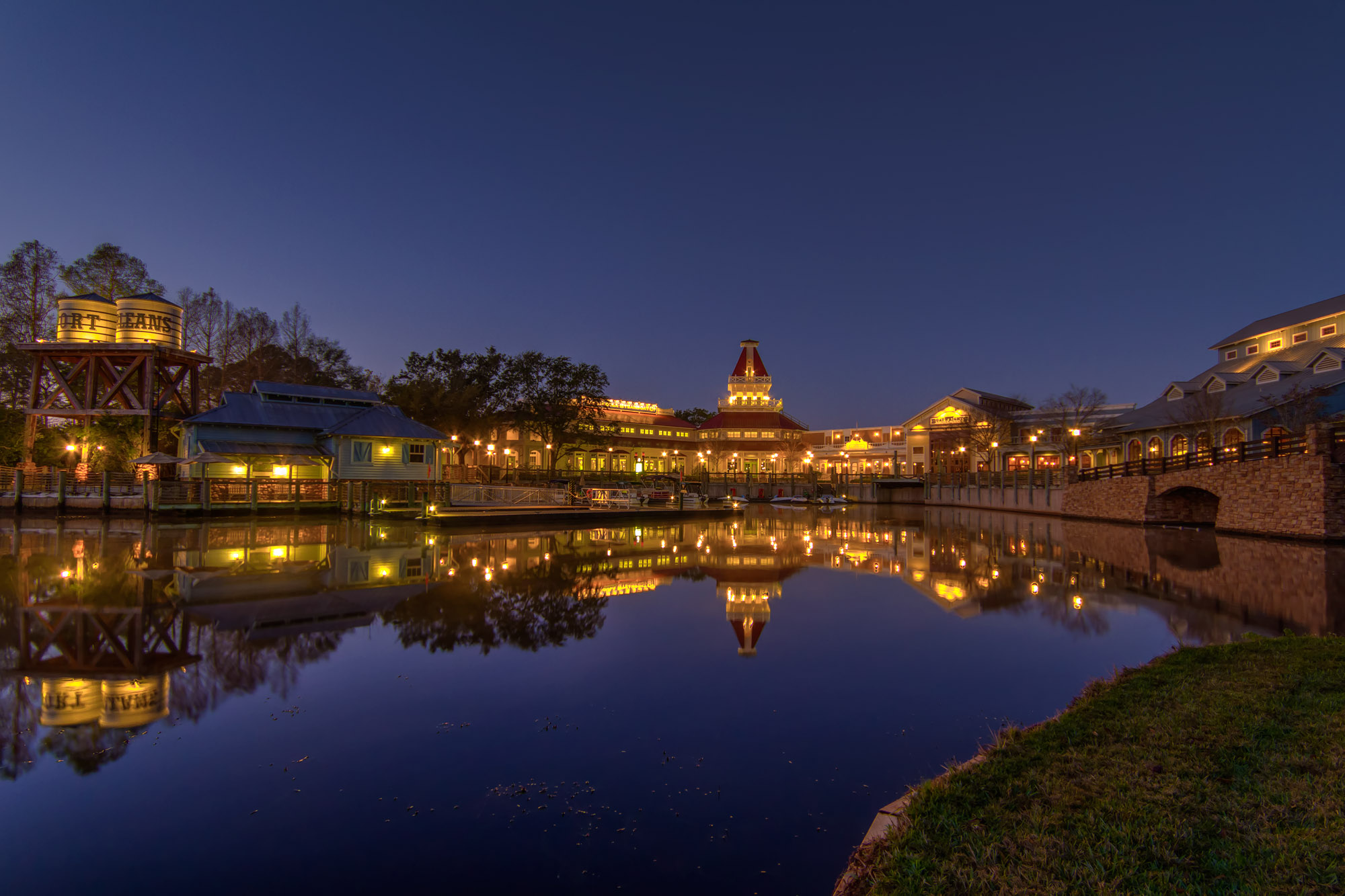
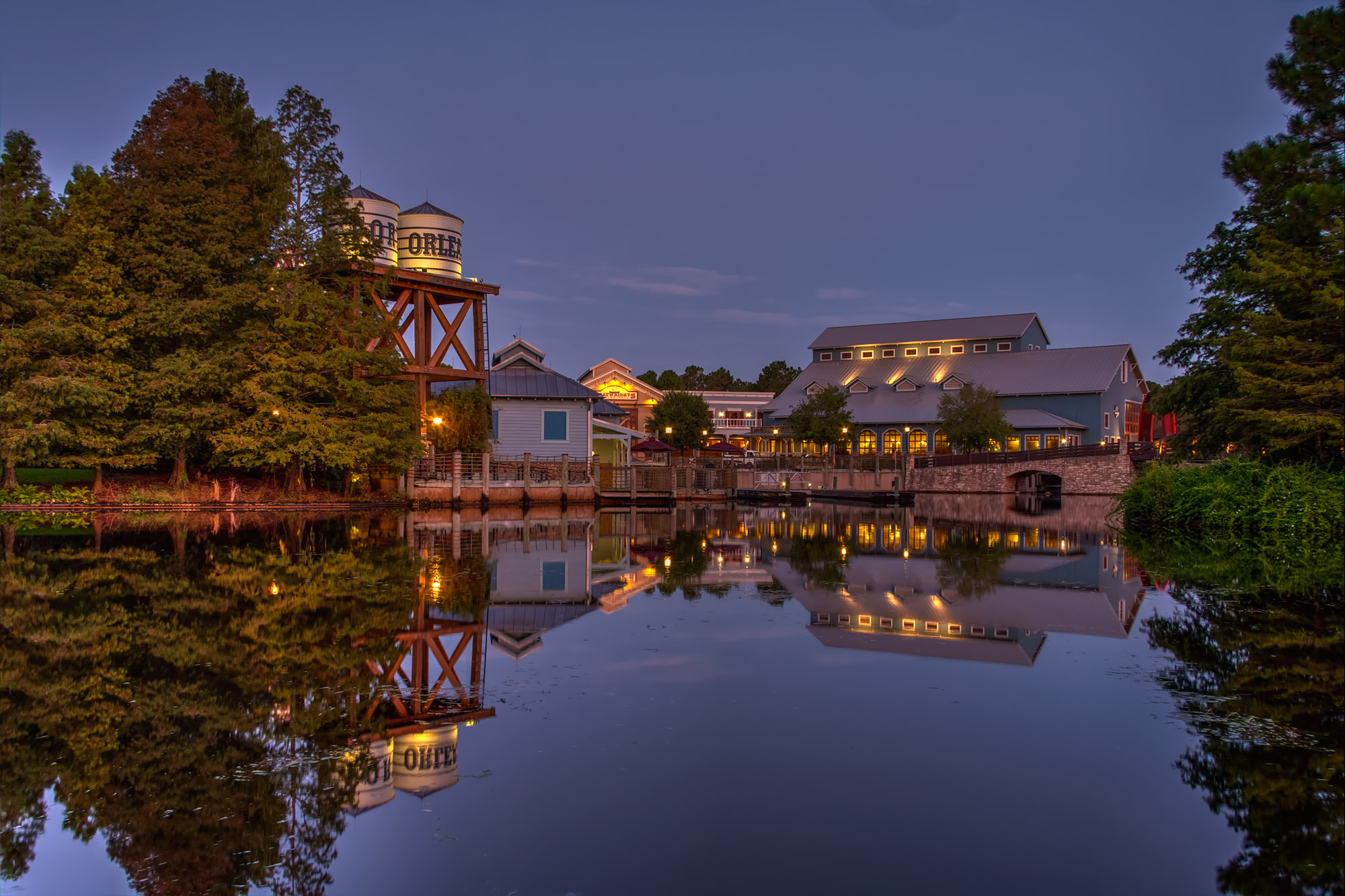
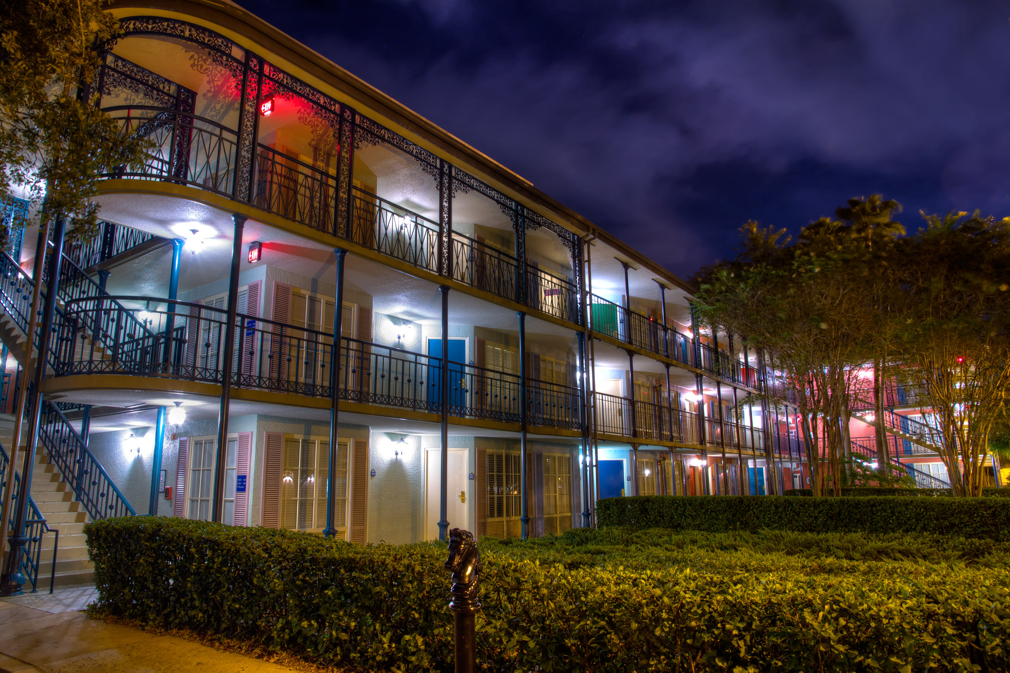
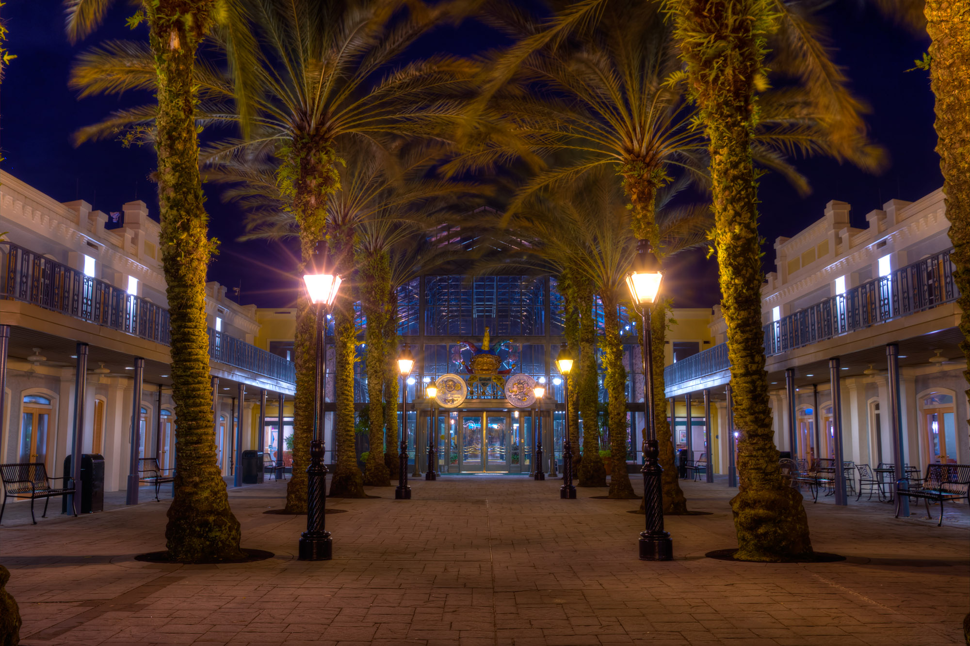
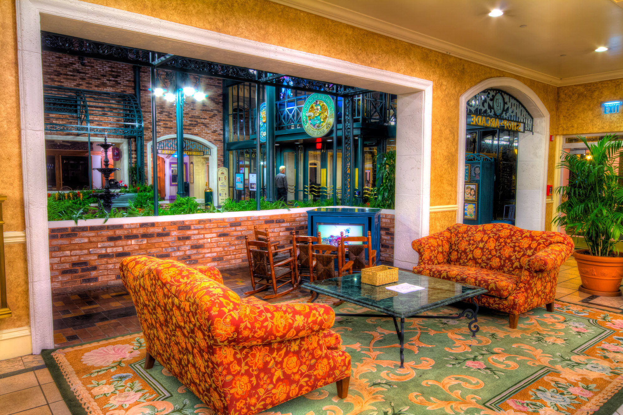
I've been working on a batch of Port Orleans Riverside images, and I'm finding that Contrast Optimiser seems to give me more natural images than Details Enhancer (and far less controls to worry about too - which in Detail Enhancer seem to fight each other a lot of the time anyway)
Andre
")